Concept
Barbier Zwölf
Concept for a barbershop: prices, appointments and attitude – dark, sharp, no detours.
View the concept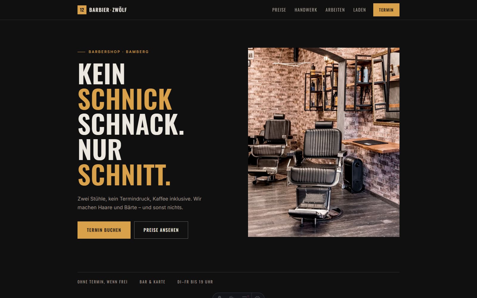
- 01
Starting point
Barbershops live on recognition. Online, almost all of them look the same: light layout, stock photo, contact form.
- 02
Goal
A presence with its own signature that shows prices clearly and cuts booking down to one tap.
- 03
Concept
The price list is the main event, set like the card on the shop wall – large, deliberate, non-negotiable. Around it, only the essentials.
- 04
Design
Near-black ground, bone white and a warm brass as the only accent. A condensed uppercase typeface gives the page its edge.
- 05
Build
Contrast kept above the minimum throughout so the dark surface stays readable in sunlight. Booking and phone always within reach.
- 06
Design goal
the site should feel like the shop – not like a template with a swapped logo.
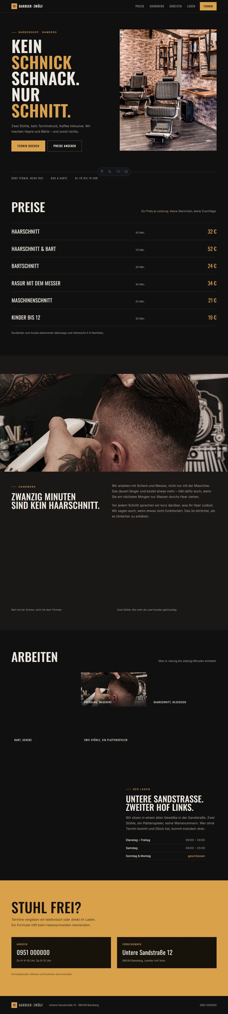

What was built
- Brand and naming concept
- Price list as a design device
- Booking flow
- Art direction close to black and white
- High-contrast dark interface
- Mobile optimisation
Three decisions
Dark, but legible
Dark pages usually fail on contrast. Here every text sits above the minimum – measured, not guessed.
Prices without asterisks
“From” prices create suspicion. One price per service, done.
No contact form
Nobody writes an email for a haircut. Booking and phone are enough; a form would only add friction.
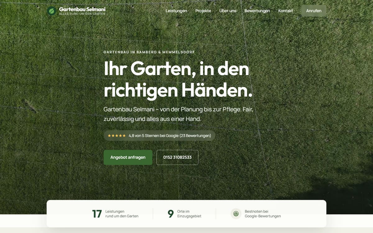
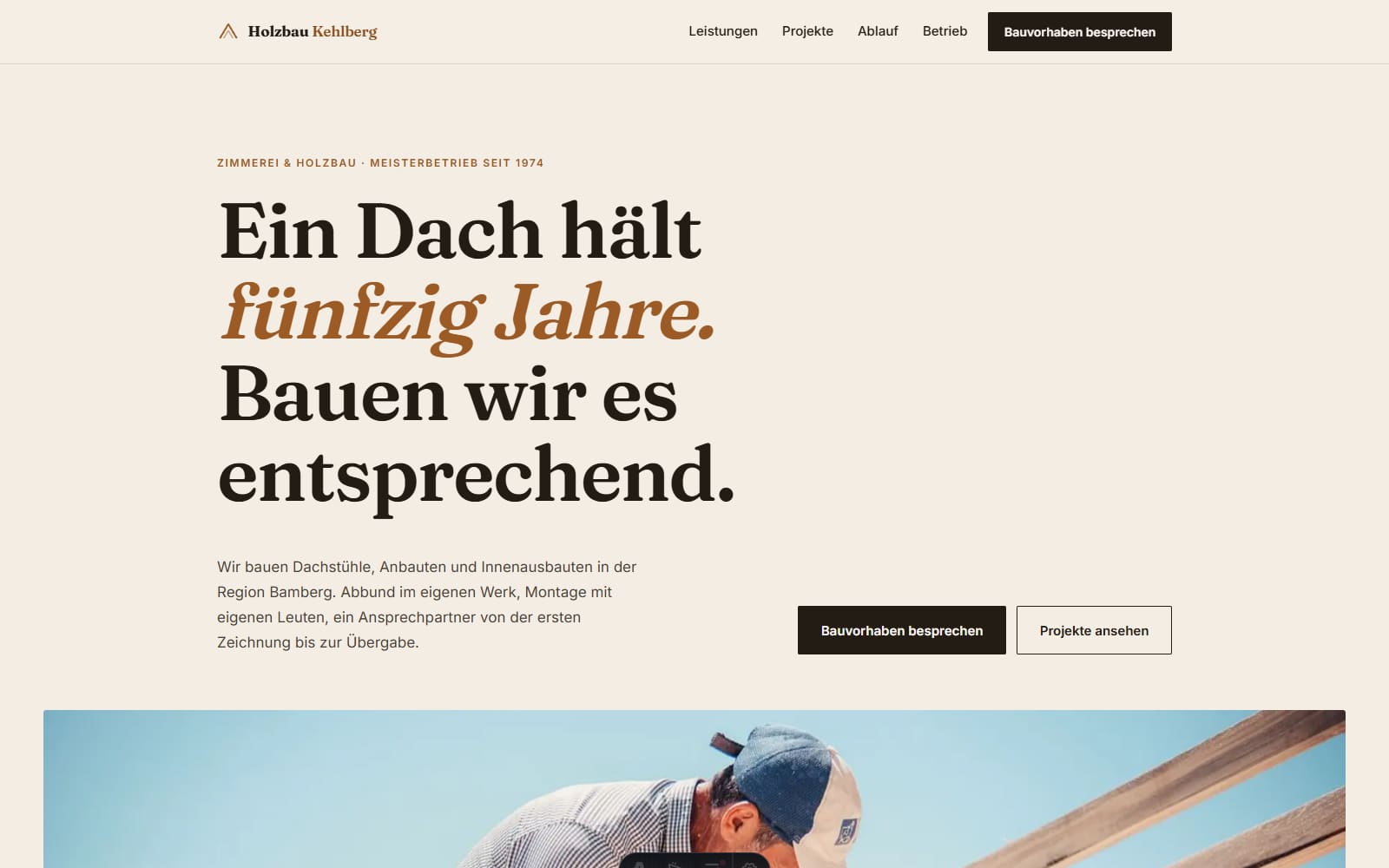
Your business is missing here.
We build you a first draft before you pay anything. After that you decide in your own time.
Get a free design draft